


In today’s digital marketplace, your customers are browsing from everywhere — smartphones, tablets, laptops, and even smart TVs. That means your website must look great and function perfectly on all devices. Two popular approaches make this possible: responsive design and adaptive design.
At Limelight Galaxy, we often get asked: Which is better for my business?
Let’s break down the differences, benefits, and best uses for each — so you can make the right choice.
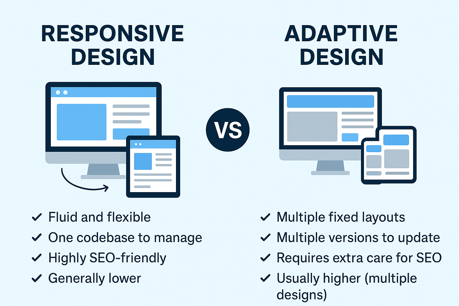
What Is Responsive Design?
Responsive design uses flexible layouts, images, and CSS media queries to adjust a website’s appearance automatically based on the screen size.
Think of it as liquid design — the content “flows” to fit any screen.
Key benefits of responsive design:
- 📱 Mobile-first flexibility — Works seamlessly on every device size.
- ⚡ Easier maintenance — One website, one set of code.
- 🔍 SEO-friendly — Google recommends responsive design for better search rankings.
- 💰 Cost-effective — No need to create separate versions of your site.
Example: If you resize your browser window and the site elements shift fluidly to fit, that’s responsive design at work.
What Is Adaptive Design?
Adaptive design uses multiple fixed layouts for different screen sizes. When a user visits your site, the server detects their device and delivers the most appropriate layout.
Think of it as having several pre-made outfits — you choose the one that best fits the occasion.
Key benefits of adaptive design:
- 🎯 Device-specific optimization — Perfectly tailored layouts for set screen sizes.
- ⚡ Potentially faster load times — Only loads what’s needed for that device.
- 🎨 Highly customized experiences — Ideal for audiences with very specific device usage.
Example: A site might have one version for mobile, one for tablets, and one for desktop, each designed separately.
Which Is Best for Your Business?
- Choose Responsive Design if…
You want a cost-effective, SEO-friendly site that adapts to any device without needing multiple versions. Perfect for most small to medium-sized businesses. - Choose Adaptive Design if…
You have a large budget, want highly customized layouts, or serve audiences with specific device needs (e.g., a gaming platform optimized for certain tablets).
At Limelight Galaxy, we often recommend responsive design for most businesses because it offers the best balance of flexibility, SEO benefits, and lower long-term costs. However, adaptive design can be a powerful choice for specialized projects.
Your website is your digital storefront. Whether you choose responsive or adaptive design, the key is ensuring it delivers speed, usability, and an engaging experience for your audience.
At Limelight Galaxy, we build websites that are beautiful, functional, and optimized for growth — no matter the screen size.
📞 Contact Limelight Galaxy today to discuss the right design approach for your business and get a site that works perfectly everywhere.
